During my time at FMG, I created a vast range of design work covering risk advice, email templates, internal and external website content, social media posts, infographics, helping with advertising campaigns, media schedules and awards submissions.
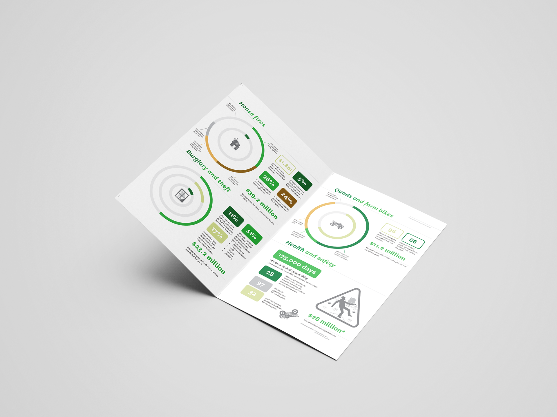
Regional risk advice guides (2018)
Each region had an advice guide created which contained important information that clients could look over when assessing their risk on their properties. This aimed to inform them on what sort of cover they might need when insuring their land. Since each region was different, it was important the information was displayed in a way that was easily digested and visual as the clients don't often have time to read through pages of content. All the guides had an image that represented the region and different infographics catered to the clients needs.
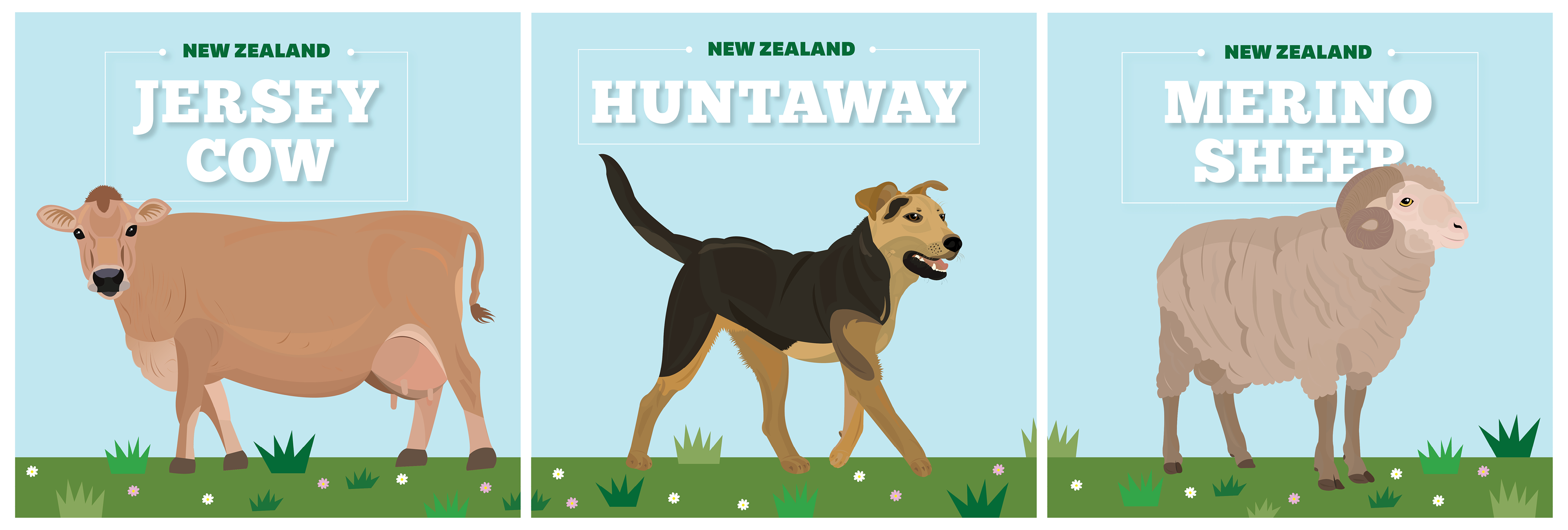
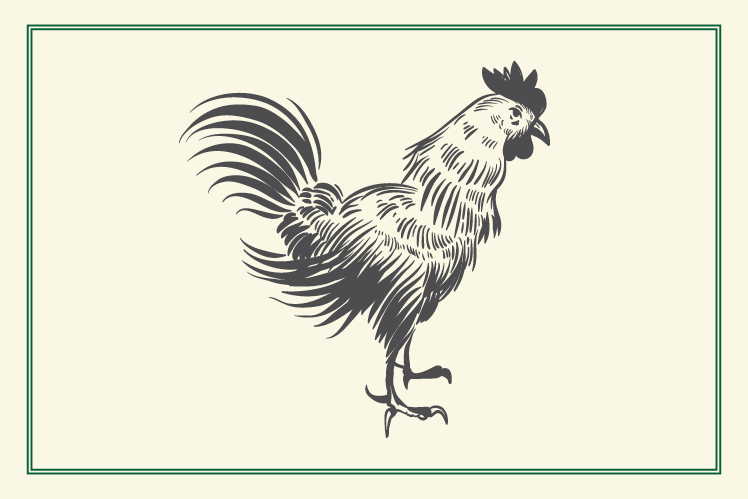
Social media illustrations (2018)
These were created as Facebook posts in a campaign to celebrate New Zealand farming and our animals. The illustrations were fun to create, I kept them bright and simple so that they would draw attention on a social feed.
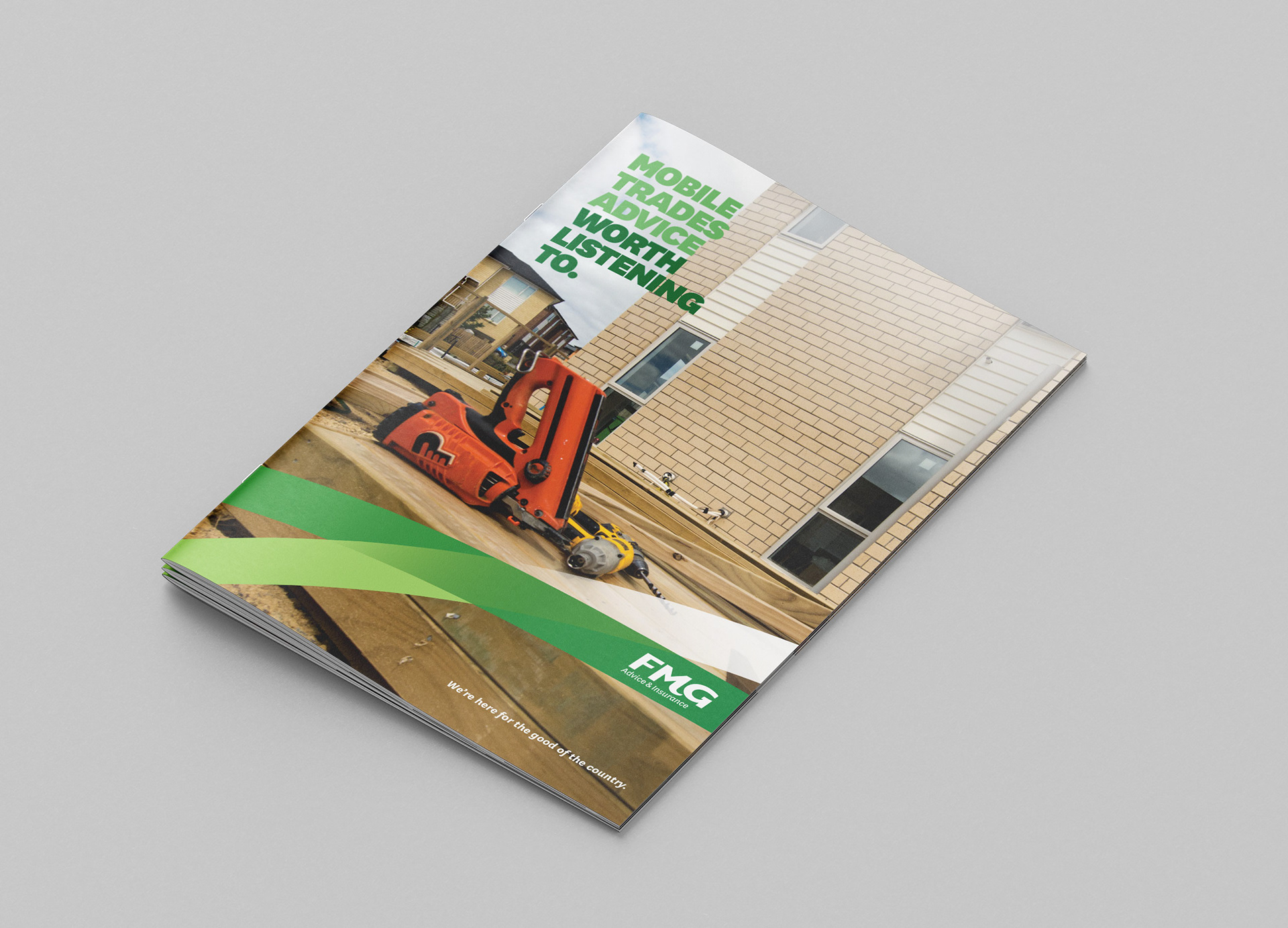
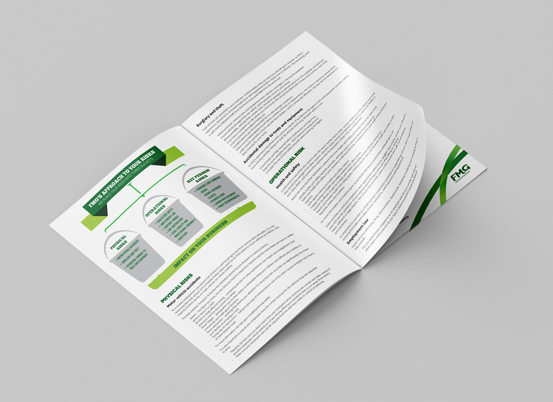
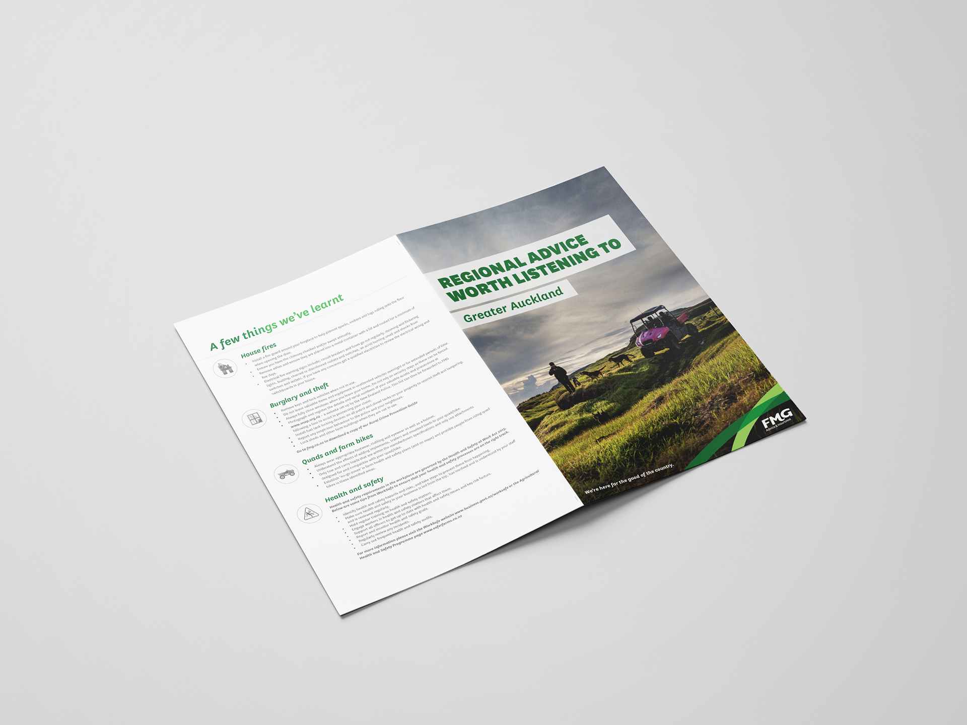
Mobile trades brochure (2018)
This brochure was part of the "Advice worth listening to" campaign. The aim was to keep it simple with key information for clients and what the risks could be.
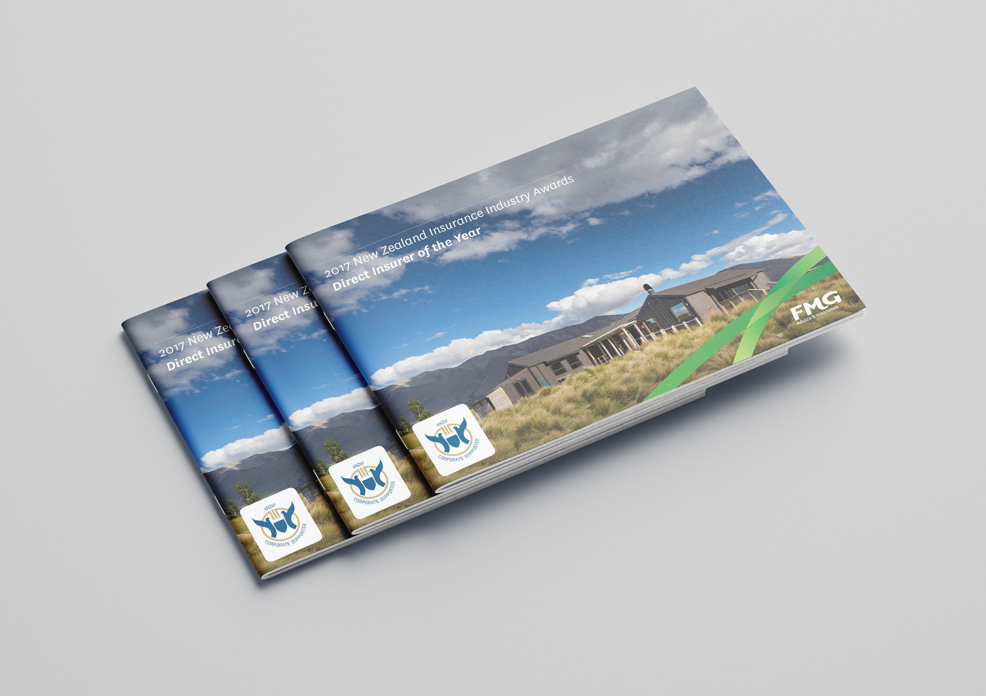
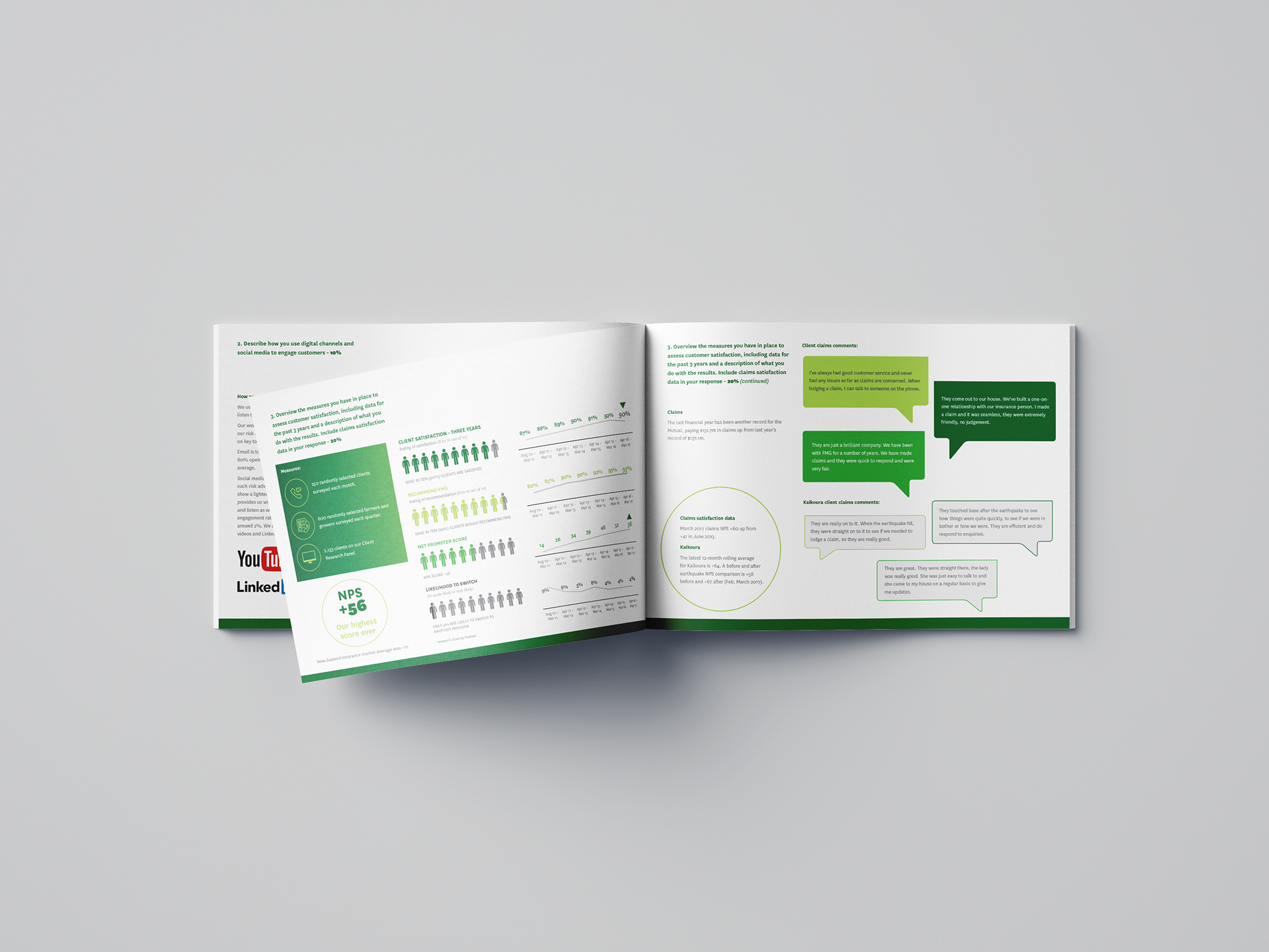
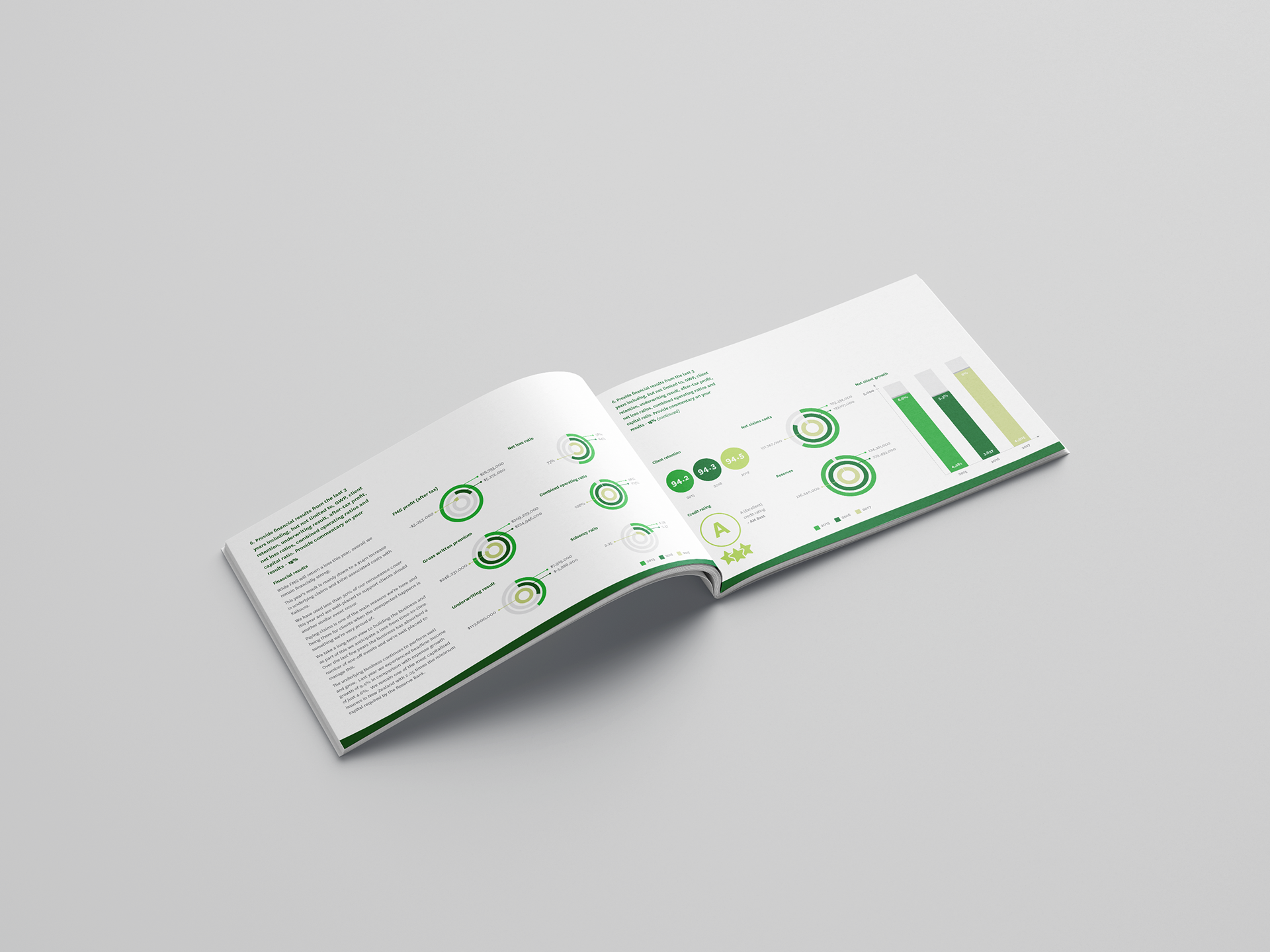
ANZIIF Insurance Industry Awards Submission (2017)
Insurance companies around New Zealand and Australia enter the ANZIIF awards to unite all sectors of insurance in a celebration of excellence, professionalism and community. The awards are a platform to recognise business achievements and positive impacts the industry has had on people and the community.
I was tasked with designing FMG's submission for these awards (which we won!) in 2017. The brief I was given was to keep the submission clear and concise, easy to take in and ensure our key information attracted the judges attention throughout the document. I was proud when FMG was announced Direct Insurer of the Year.

Policy wordings (2017)
The brief for this project was to create policy wordings that were in Plain English so that clients could understand their policies better with readability in mind (e.g. no insurance jargon, complicated layouts). Research at the time showed that using one column for the body copy was easiest to read with larger headings and lots of blank space.
All the covers for these policies looked the same with a monochromatic image relevant to the policy, the clear FMG branding and simple layout on the inside. Even though the design was simple, the main objective was the clients and making their lives easier. There was a large amount of policies I had to design but overall I was happy with how they looked and it was good for me to strip back the design to meet the audiences needs.
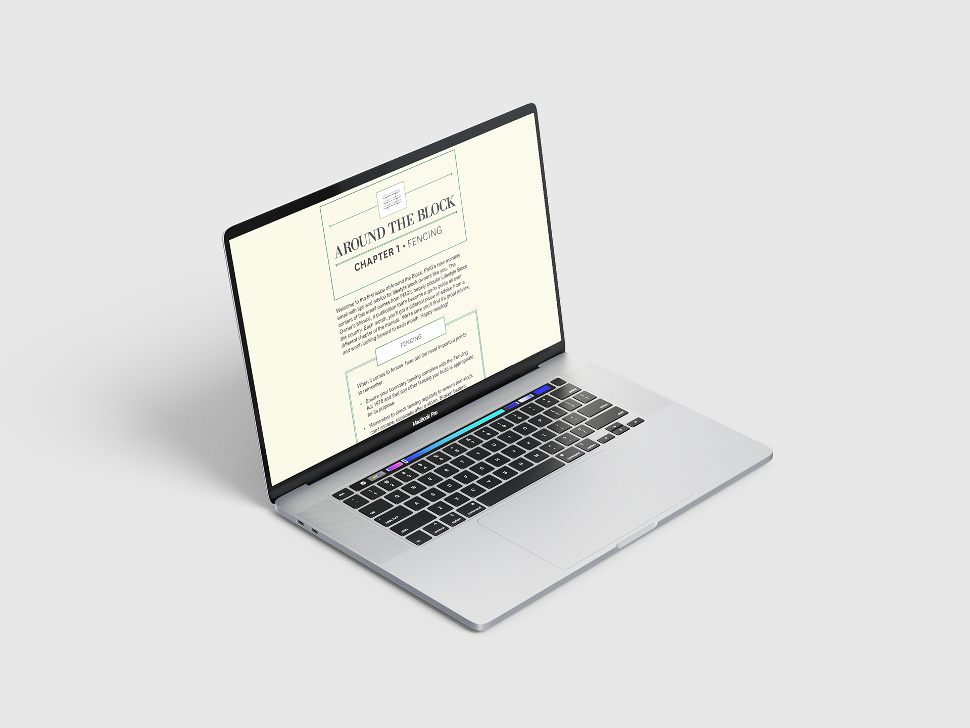
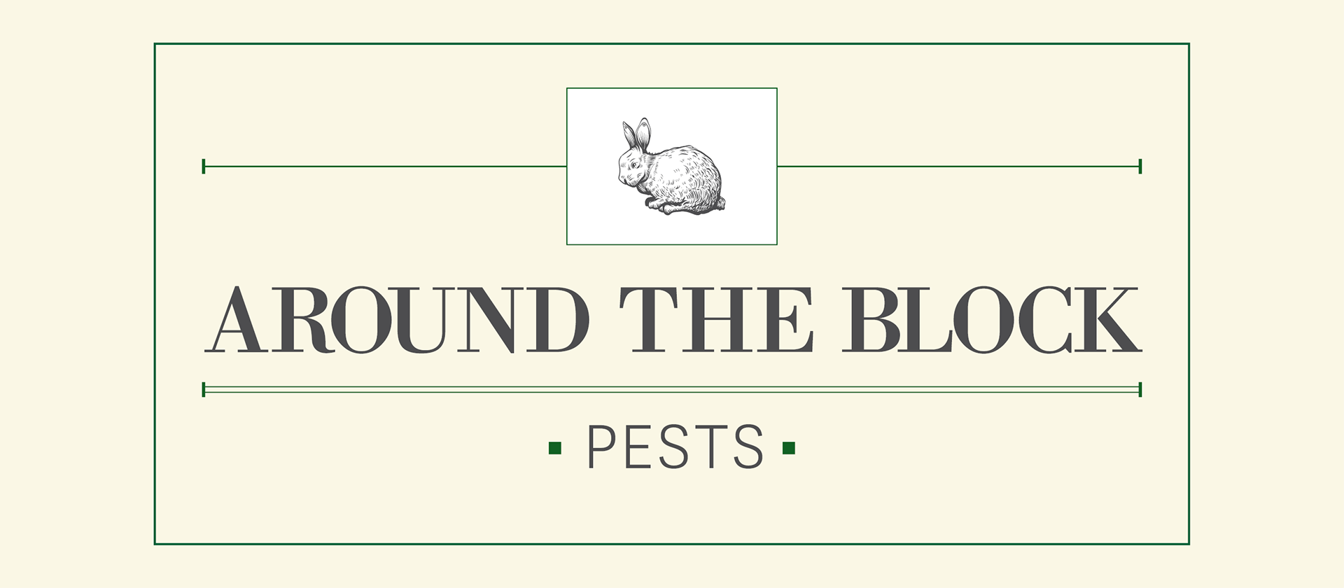
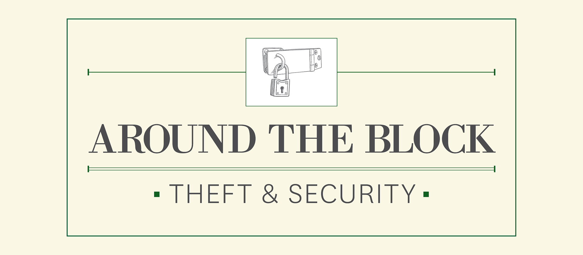

Around the block (EDM templates)
These emails were sent out to lifestyle clients, which included chapters about a range of subjects that they could possibly face owning a lifestyle block. These were about a range of things, including fencing, pests, llamas and alpacas, theft and security etc. This campaign had a slightly different look and feel to the other design work I'd worked on for FMG but still remained true to the companies brand identity.
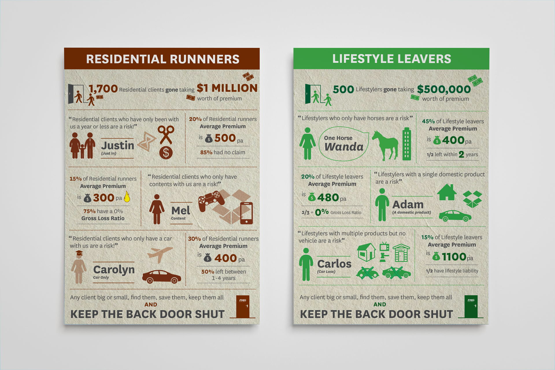
Infographics (2018)
These infographics were based on personas developed through company data to show the expenditure of different parts of FMG. They were meant to be a bit fun and quirky, with reference to "One horse Wanda" (a lifestyler) or Carolyn (car-only) as examples of the different people who have insurance nationally. Each graphic had a different colour to ensure they were recognisable for those using them as a reference.